
Colour, as we perceive it, is a trick of the light; a love letter gifted to us by a universe that is made up of wondrous things. And yet, it is a factor so intrinsically tied to our happiness and well-being that colour psychology predates psychology. Egyptians practised colour healing, building temples that allowed light to pour through rubies, emerald, and sapphires, tinting the stone to the shade that would best heal your illness. Across the world, one of the oldest medical documents published, the Huangdi Neijing, used colour to diagnose illnesses in patients: red, linked to the heart and the small intestines; green, for the liver, yellow for the spleen, black for the kidney, and white for the lungs.
In more modern practices, colours have been proven to soothe and reinvigorate. University researches in Lille found that greenery and colours both showed a boost in morale. Interior designers espouse frequently on the use of natural timbers to add warmth into the homes, on designating colours such as blue for restful areas and red for living rooms and kitchens, yellow flowers for the garden to brighten up dull days, creamy white shades for bathrooms and places with less sunshine to lift the gloom.
We are also fortuitous enough to live in a time where access to colours is, widely, simplified. Technology has given us a kingdom’s fortunes of colour options, and what previously would have taken an artist’s life work to document is available to us with a few button clicks, and where that colour can go wherever we desire: on wood, on steel, on polymer, on tile, on glass, beautifying the spaces that we spend most of our time in. Whether it’s a city centre or a sleepy village square, a little splash of colour stops the world.
Our products have always been available to you in one of over 200 RAL shades, and that option is still there.
However, we have taken the liberty to ease your burdens further and to lift one more consideration off the plate of your placemaking decisions.
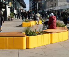
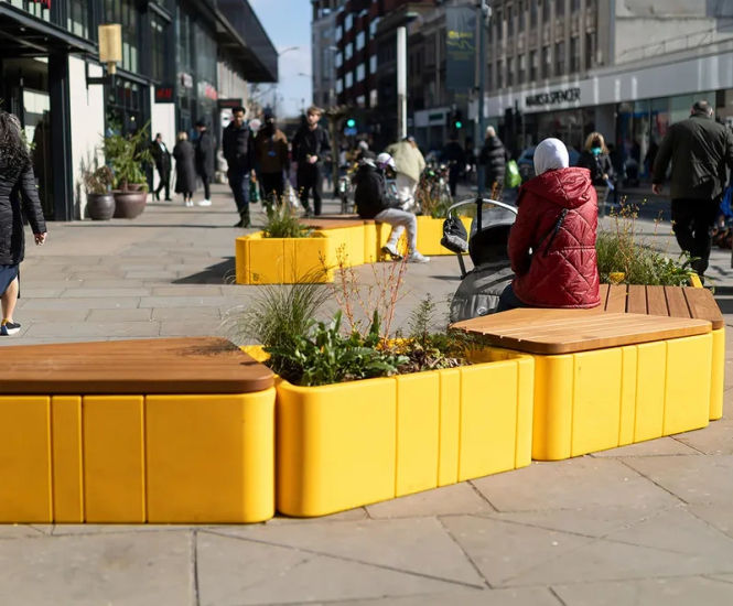
From now, all of Furnitubes’ core furnitures will be ready available in a reduced colour palette, standardised across all our product lines, with no additional lead time required. This gives you greater opportunity to branch out of the standard grey and brighten up builds both new and old with a little touch of what people turn to poetry.
And you don’t need to be a colour expert to pick the colour that would suit your project best.
Click VISIT WEBSITE below / opposite to see the colours we chose, and what went into the selection process.